GMCSCO Media Group

Others

Landing Page Key Elements

What are the Key Elements of a High-Converting Landing Page?

Simply put, a landing page is absolutely essential for any online marketing strategy. And a landing page is designed with one goal: to get visitors to do something (such as buy, sign up for an email list or download an e-book). In this article, we talk about the essential components of a successful landing page that would turn visitors into leads or into customers. Compelling Headline When people land on your page, the headline is what they see first. It should be: Clear and Concise: Get your main benefit or value prop across in a couple of words. Attention-Grabbing: Hook your audience with forceful action-oriented wording. Appropriate: Make sure the headline relates to ad or link that led the visitor in. Example “Get Access to Premium Online Courses Today!” Engaging Subheadline A subheadline is more than a simple headline. Alone it offers further context and explains the evidences provided by the main headline. It should: Explain the Headline: Provide further context or detail about whatever you are offering. Encourage Further Reading: Spark intrigue and guide the visitor towards other content. Example “Join thousands of learners and take your first steps on the path to mastering a new skill with our expertly curated courses.” High-Quality Visuals This section has the option to add pictures, which makes your landing page enticing and interactive. They should be: Contextually Appropriate: Tied to the product or service being sold. High Resolution: For professional looks, covering better credibility. Speedy Loading: Correctly compressed so that the site can load quickly. Example “An image of a person using their laptop in an online course, or even better would be a snippet of testimonials with people talking, showing them how they loved the video.” Clear and Persuasive Copy Copy on your landing page: Customer-Focused: Problem-centric, addressing fleeting pain points and needs of target customers. Benefit-Oriented: Highlight the benefits, not just the features, of your product or service. Readable: Utilize bullet points, short paragraphs, and sub-headings to break up the text. Example “Our online courses are designed to give you the most up-to-date information in a way that’s both informative and can be immediately applied at work. Learn at your own pace as our courses are designed to fit into a busy lifestyle.” Strong Call-to-Action (CTA) Strong CTA is a must for conversion. It should be: Visible: Color-contrast, strategic position on page. Actionable: Remember to use action verbs, e.g., Download Now, Sign Up Today, Start your journey. Clear and Specific: Make it starkly obvious what the visitor is going to get when they click that button! Example “Get the Free eBook” or “Start Learning Now” Trust Indicators Trust is an important factor in order to convert. Trust indicators can include: Customer Reviews: Positive feedback from satisfied customers. Case Studies: Demonstrating real-world results. Trust Badges: Security certificates, industry awards, and logos of recognized partners. Social Proof: Number of subscribers, followers, or users. Example “Best Online Learning Platform 2024″ in collaboration with educational institutions award emblem.” Lead Capture Form If your goal is to observe information from visitors, make sure your form is: Keep it Simple & Quick: Avoid unnecessary information that would create friction. Visually Appealing: Match the design of your landing page and ensure it’s easy to fill out. Safety: Tell them that their information is going to be protected. Example “A signup form with fields for name and email, along with some reassurance like “We absolutely hate spam too (probably more than you) so don’t worry — we’ll never share your information.” Mobile Optimization Since an ever-growing number of users are now on mobile, your landing page needs to be: Responsive: Automatically resize to fit any screen. Quick Loading: Built to load fast and keeps mobile bounce rates low. Simple User-Friendly Interface: Large buttons and text that is easier to read on smaller screens. A/B Testing In order to consistently increase the effectiveness of your landing page: Test Different Elements: Headlines, CTAs, images, forms, etc. Analyze Results: Use tools like Google Analytics or A/B testing software. Iterate and Optimize: Use data to make informed decisions on how you can improve your page over time. Example “Headline Testing: Test two potential headlines against each other to determine which one provides the greatest conversion, then use that headline.” Follow-Up Strategy Making a landing page is not where your conversion ends! Have a follow-up plan: Thank You Page: Send visitors straight to a separate thank you page where they can get the next steps or additional offers. Email Confirmation: Acknowledge their action with a confirmation email, which can also be seen from your review cue. Retargeting: Reach non-converting visitors with retargeted ads. Conclusion Creating a compelling content with engaging graphics paired up in the right design will get you a high-converting landing page. With these critical matters in focus and ongoing tests & optimizations, you can drive up your conversion rates high enough to reach marketing goals. Ultimately, the goal is to provide an experience that seamlessly and convincingly leads your visitors down a path they are comfortable with. Also Read About What is Landing Page and its Importance Landing Page Mistakes to Avoid

What are the Key Elements of a High-Converting Landing Page? Read More »

Landing Page Mistakes

10 Common Landing Page Mistakes to Avoid

An effective landing page is vital to convert your visitors into quality leads and sales. But, as skilled a marketer you are, there can be some mistakes that serve well to slow down your landing page in its pursuit of glory. Optimize your landing page for success suggested reading: What are the most common mistakes of a good website? Thick Design Mistake: Placing too many elements (images, text, and videos) on the landing page creates chaos for visitors. Solution: Clean, simple design. Focus on one Call-to-action (CTA) and make crucial info readily available. Use whitespace appropriately to direct the focus of visitors on detail items. Weak Call-to-Action Mistake: A weak call-to-action tells a website visitor that they should do something but fails to instruct them how. Solution: Clear, strong CTA – no more hiding that call to action; make it easy for people who are already ready! The wording you choose should inspire them to act right now or in the next series of steps, e.g., Download Now, Sign Up Today, Get Your Free Trial, etc… Slow Loading Speed Mistake: One layout mistake has slowed down load times which can make visitors frustrated and give bounce rate. Solution: Compress images, collaborate only with reliable hosting services, and minimize using heavy scripts on your landing page. For one, you may use the likes of Google PageSpeed Insights to analyze for places wherever enhancements can be made. Mobile Optimization Mistake: Poor user experience occurs when potential customers are sent a landing page that is non-optimized for mobile. Solution: Make your landing page responsive and seamlessly adapt to all types of devices, especially smartphones/tablets. Test your page on different devices. Slow Loading Speed Mistake: Headlines that do not entice visitors in stand no chance. Solution: Develop an attractive headline that communicates exactly what your lead bribe is. Use vibrant words as they are direct and instantly eye-catching – the headline of a blog should not only tantalize but describe what its page is about. Too Much Text Mistake: overloading the landing page with text can discourage users from reading through all of it. Solution: Keep the text short and direct. Bullet pointing, subheaders, and shorter paragraphs will aid in creating easy-to-scan content. Focus on the top benefits and stay clear of unnecessary jargon. Ignoring Visitor Pain Points Mistake: If you don’t address the specific needs and pain points of your audience, it’s likely going to mean poor engagement — as well as lower conversions. Solution: Know who your target audience is, and use that knowledge to solve their problems with a unique selling proposition. Speak their language and explain to them in clear terms how your offer can address what they are facing. Cheap Visuals Mistake: Another reason some business owners had site visitors who declined the free offer is because they use poor low-grade images that do not match the message or brand. Solution: Use some good, sensible and relevant pictures and videos that support your message. Make sure images are high-quality and serve to improve the overall aesthetic of the landing page. Too Little Social Proof Mistake: If you do not add social evidence (like testimonials, reviews or case studies) visitors are very unlikely to trust your provide. Solution: Use social proof elements such as testimonials, star ratings and case studies to establish trust and credibility. Call out kudos and data that proves your product or service is being well-received. Ignoring Analytics and Testing Mistake: Failing to track results and optimize based on data can cause you to miss opportunities rather insensitively. Solution: Monitor your landing page performance with analytics tools. Monitor important metrics like your conversion rate, bounce rate, and time on page. Use A/B testing to test different attributes against one another and, depending on what the results are, continue to optimize in favor of better performance. Conclusion By avoiding these common landing page mistakes, you will make your call to action MUCH more compelling and effective. You can make a landing page that will bring both, prospectively you should provide impeccable design and clear CTAs to enhance its capability wait hall has then now for turning visitors into consumers. Make sure you are continuously testing and optimizing the page to maintain its effectiveness correlated with your audience.

10 Common Landing Page Mistakes to Avoid Read More »

What is Landing PAge

What is Landing Page and Why it is Important?

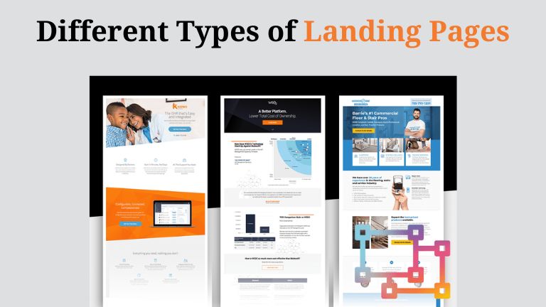
Landing pages – your website’s closer, not a maze Suppose you see an ad for a tasty new pizzeria, juicy images incorporated and the guarantee of maybe “free garlic knots with your first order!” Hook and bait, you click the ad to fulfill your craving. Instead of being met with a gooey, cheesy page you are suddenly thrust onto an information-rich site brimming about all kinds of yoga lessons, dog-grooming services and wait…where’s that pizza? Welp, this is what landing pages are meant to prevent users. What are landing pages anyway? A landing page is a single web page created for a marketing or advertising campaign. Consider them your site’s closer – their sweet siren song of whatever that irresistible (or on sale, educational, etc.) offer is. What is a Landing Page and Why is it so Important? After all, with the short attention spans of today’s internet marketing crowd… Nobody wants to be finding treasures in a maze. This is why landing pages matter – they remove uncertainty and bring the right message to just that person who clicked upon your ad or offer. How Landing Pages Turn Clicks into Conversions (A Fancy Marketing Word for Getting People to Do What You Want Them To) Landing pages do one thing: promote a single offer. Basically, a headline that conveys exactly what the offer is, bullets on the benefits of said offer and solid branding – like high-quality visuals to stop people from scrolling past. Landing page as an eavesdropper in conversation in the target audience they actually scrape the ad or link that redirected the visitor and use in message as a personal one. Take an ad for a fitness guide, that guarantees you free access to it – pimps out all the good in its offer (and little of anything bad), then directs any clicker-throughers to a landing page having everything possible and impossible selling how gym will improve your life & savings with testimonials from happy fitness-kids. Easy as Pie: Never Look for Misplaced Buttons again! Landing pages show the visitor exactly what you intend them to do next. Free trial, sign up for a newsletter or buy now with Contrasting call to action (CTA) button that tells them exactly what you want they clicks on. Focus = Results: By stripping down the experience and removing any distractions, landing pages are far more likely to turn readers into customers. Leading to more sign-ups and in the long-run an increased number of sales and obviously – a happier you! Also Read About landing page management tool The beautiful thing is: you do not have to spend thousands of dollars on a fancy landing page. By including clear headlines, engaging visuals (pictures and videos – NOT complex charts), your landing pages will be a lot more effective., and easy-to-read text. The secret of course, is to make sure your offer has value to it and that saying “yes” makes absolute sense! Figure out how to cut through the website maze straight to a landing page that complements your site perfectly right here It is the secret to converting those curious clicks into committed customers and in getting your online marketing efforts right! Also Read About: SEO Services in Bangalore How to Avoid SEO Disaster during a Website Redesign

What is Landing Page and Why it is Important? Read More »

Loan Management Software

Loan Management Software: A Case Study

The best inventions are those that address a specific human need. Once understood and applied, the answer quickly gains widespread acceptance because its creators overcame the challenge alone. With our clients’ loan tech application, it is the situation. Like other parents, the founders wished to provide financial support for their offspring. But there were unclear regulations governing the money lending procedure. It became clear right away that kids don’t have the necessary knowledge about their obligations or how loans work. Due to the protracted payback process, any reminders led to arguments within the family. We recognized the necessity for an online loan management system (software) that can govern the entire loan procedure with the loan agreement and impart good financial literacy to kids. LMS, for lending organizations, is a cloud-based, user-friendly lending solution with intelligent automation specifically made for the full-service execution of a loan lifecycle. The reminder mechanism makes it possible to prevent interpersonal disputes. It became evident with time that any relationship might benefit from such a loan management system. The business logic had to be changed to accommodate the loan tech app. Along with the concurrent solution infrastructure upgrade, frontend, and backend development, the GMCSCO Media Group team contributed to the introduction of the essential business model upgrades. The Challenges: We entered the field of developing client solutions, but not from scratch. Our client families had initially launched and thoroughly tested the money lending platform. The creators sought to make the concept accessible to everyone as it became clear that there was a need for it. It required us to thoroughly assess the functionality already in place for both the Borrower and Lender roles, become familiar with the codebase, and suggest the necessary updates along with a detailed roadmap for the development of the app. Numerous obstacles were overcome throughout the development of our client’s product. The key hurdle was making the switch to the new business logic of the loan management platform. We had to make sure the system functions consistently, user data was secure, and the user experience was even better. For both app developers and clients to have a clear understanding of the desired outcome, the user flows, and app user behaviors had to be documented by a trained business analyst. However, we specialists stayed committed to the major company objectives seen in a reliable loan management program. Our Excellent Solutions for Clients: Our developers made several technical adjustments to execute our clients’ requests while guaranteeing the security of user data and a consistent user experience. Improved Business Logic: To establish a clear image and avoid system redesigns, our business analysts have developed a well-considered roadmap of adjustments. Change in Subscription Model: The subscription plans have changed. Now, to complete transactions, all users, not just parents, must contribute a portion of the loan amount. Integration of Payment Providers: Our programmers have set up efficient payment processing using a Split paymentgateway that goes straight to the user’s bank account. Plan for Repaying the Loan: Our clients can now select the date of repayment based on their preferences, thanks to the flexibility we have included in the payment schedule calculation process. Testing the Database: Our quality assurance team has thoroughly tested the data to ensure that the changes we applied did not affect the security of the users’ data. Interactive Apps: Our development team has improved the responsiveness of our client app by implementing the best concepts. It enables real-time asynchronous sending and updating of data portions. Therefore, only the element in question changes when a user enters data on a website and the entire page does not. Our development team has selected .NET Core web API for backend development and React as the primary technology for frontend development. It enables high performance and interactive app functionality. We were able to maintain user data with the help of MySQL Server as a database and Azure cloud. The client app’s infrastructure was updated with AWS’s assistance, which also increased deployment flexibility. The Best Results: We enjoy working with our clients that have innovative concepts. Our development team at GMCSCO has greatly enhanced the basic idea of a family-focused money lending solution to become a world-class loan management system available to anyone. Our expert improvement roadmap has sped up processes, improved app responsiveness, safeguarded user data, and produced a pleasing user experience for our clients. Technologies and Tools: Microsoft ASP.NET MVC, .NET Core, Web API, MS SQL Server as Database, Azure Cloud, Visual Studio 2019, Testing Tools, SOAP UI, Postman, Jira, Bitbucket, etc. Conclusion Our team had been proficient in using.NET technology to create unique Loan Management Software that met the client’s needs. Including functions such as automatic loan processing repayment checks and assessing risk which contributed in more efficient and carefully-managed lending process. In closing, financial institutions use LMS to change how they handle lending procedures. This programme, for example, automates the origination of loans and their approval, services (such as accepting repayments on an installment basis), collections. As a result it results in several important benefits: increased efficiency; an improved customer experience from start to finish; and lower ongoing costs. Through the presentation of this case study, we have seen that among financial institutions loan management software has been truly a success story, a right choice and also very effective. For financial institutions which are adapting to the ever-changing new requirements of industry Embracing loan management software is an absolute must if you are to remain competitive and keep satisfying customers. Being able to integrate with existing systems and procedures in LMS means it is a helpful tool that brings discernible novelties of effectiveness and production efficiency. By evaluating the return on investment, financial institutions can face with certainty that they are making the right choice by installing loan management software. And thus a road is paved for smoother and more fruitful lending operation;

Loan Management Software: A Case Study Read More »
Core Web Vitals

Optimizing Website Performance for Core Web Vitals in 2024

User experience is one of the most important attributes of the digital world. Over the past several years Google’s Core Web Vitals have become extremely crucial in adjudging a website’s overall search ranking. It also governs key aspects of user experience such as webpage loading speed, page interaction, and stability across multiple devices and browsers have gained critical importance. Google’s Core Web Vitals for 2024 relate these metrics to Largest Contentful Paint (LCP), First Input Delay (FID), and Cumulative Layout Shift (CLS). Let’s try to understand their correlation with website development. Understanding Core Web Vitals: Largest Contentful Paint (LCP): LCP is the time it takes for the  largest content element (text or image) in a webpage to completely render on the users’ screen. Website developers should aim to keep the LCP below 2.5 seconds to ensure that the initial page loads fast. First Input Delay (FID): FID is the time it takes for a webpage to begin interacting with its users. Google recommends that website developers should target an FID of below 100 milliseconds so users experience a quick and responsive webpage. Cumulative Layout Shift (CLS): CLS if the measure of how stable a webpage’s design and layout stability is across browsers and devices while the page loads.  Though there is no benchmark, Google recommends that CLS should be as less as possible to avoid webpage elements from moving which may negatively impact the way users interact with it. Must read Website Development cost in India 2024 Core Web Vitals optimization strategies: Improve Loading Speed: Leverage caching and content delivery networks to reduce server response times. Improve page loading speed by reducing JavaScript and CSS that may delay webpage rendering. Reduce image file sizes by compressing them using tools readily available on the internet while ensuring their quality isn’t compromised. Improving Webpage Interaction: Lengthy tasks can delay user interactivity with the website as they need the user to keep waiting and onscreen/onpage time is diminishing as we progress. Eliminating time consuming tasks by optimizing JavaScript can significantly improve user website interaction. Non-essential JavaScript and CSS cause significant spike in webpage size. Hence activating them only after users begin interacting with the webpage helps with page speed and overall user interaction. Initial webpage render times are closely associated with how users interact with your website. Improving initial render times by implementing Static Site Generation or Server-side Rendering results in faster website loading. Ensure Design and Layout Stability: Eliminate layout shifts by defining standard dimensions and size for images, videos and audio. Implement CSS aspect ratios to block desired spaces for dynamic content. Offscreen images and video add up significantly to a webpage’s overall size. Developers must postpose the loading of such elements through deploying lazy loading techniques resulting in faster page loads. Monitor and Iterate: Regularly monitor Core Web Vitals metrics using tools like Google PageSpeed Insights and Lighthouse and repeat all sanitization procedures as applicable. Identify areas for improvement and prioritize optimizations based on performance insights. Developers must constantly update their knowledge of the latest Core Web Vitals guidelines in order to adjust optimization strategies accordingly. In 2024 websites requires continuous website performance optimization to incorporate Core Web Vitals in order to deliver seamless user experience and maintain a competitive edge in search rankings. By prioritizing loading speed, interactivity, and visual stability, website developers can ensure that their sites meet user and search engine expectations. Website developers must stay proactive and ensure adherence to the above mentioned performance optimization techniques to future-proof websites and stay ahead of competitors and achieve success in the present and future online landscape. Also Read About Ecommerce website development services

Optimizing Website Performance for Core Web Vitals in 2024 Read More »

Headless CMS vs. Traditional CMS

Headless CMS vs. Traditional CMS: Choosing the Right Tool for Your Project

Content Management Systems (CMS) enable users to develop websites and manage content as per their requirement. Over time, more specific requirements resulted in advancement of CMS platforms. Present CMS platforms can be bifurcated into two major categories: Traditional CMS and Headless CMS — each with their own set of unique advantages and disadvantages. The decision to ascertain which one of the two will be appropriate for your website development needs is a function of its objective, size, scope and complexity of operations.  Traditional CMS:  Traditional CMS platforms are one of the earliest developed CMS platforms, and hence are straightforward and easy to use by nature. Given that website complexity increased with time, Traditional CMS platforms are well-suited for informative websites with simple uniform layouts. Most commonly used Traditional CMS platforms include the widely used WordPress, Joomla, and Drupal. Their all-in-one projection of designing, creating and managing design, storage and delivery make them the most frequently used platforms for website development. Advantages: Ease of use: The biggest advantage of Traditional CMS platforms is their user-friendly interfaces and simplicity making them the most preferred CMS options for users across all skill levels. They provide a “What You See Is What You Get” (WYSIWYG) editor that makes content creation, editing, and publishing extremely simple. Multiple In-Built Functionalities: Traditional CMS platforms come as prepackaged tools that include several in-built features that further simplify website development and management. They need minimal customization making them easy to use for those without any development background. Some of such in-built functionalities include user management, SEO tools, themes, and plugins for user-friendly websites. Rapid Deployment: Traditional CMS platforms make it extremely efficient to create and launch websites. The vast number of pre-built templates and plugins simplify faster addition of desired functionalities. Hence, they are the most preferred option for smaller, less complex projects, especially with strict deadlines. Disadvantages: Monolithic Architecture: Traditional CMS platforms are usually monolithic in nature – meaning the frontend presentation layer is tightly coupled with the backend CMS. This makes it difficult to incorporate custom designs and complex user interfaces, limiting the flexibility and customizability of traditional CMS. Performance Issues: With Monolithic architecture also comes the integrated nature of traditional CMS platforms. As website complexities and scale increase, these can sometimes lead to performance issues. With integrations come heavy codebases and a vast number of plugins which result in slow page load times and create performance optimization challenges. Headless CMS:  Headless CMS are different from traditional CMS in the sense that they decouple (separate) the content management backend from the frontend presentation layer. This separation enables website developers to use their preferred programming frontend frameworks (eg. React, Vue.js, Angular, etc) to pull content via Application Programming Interfaces (APIs). This enables headless CMS to provide much greater flexibility and control over the website’s user interface (UI) and user experience (UX). Advantages: Customization and Flexibility: Website developers have complete control over the frontend presentation layer in a headless CMS. This enables them to create highly customized and tailored user experiences. Such flexibility is extremely beneficial for websites with custom design requirements or highly complex interactive elements. Improved Performance: Eliminating the monolithic architecture of traditional CMS platforms, headless CMS enables content optimization independent of the frontend code. This enables headless CMS to deliver much better performance in terms of faster page load times and improved scalability, specifically in the case of content-heavy sites or applications. Scalable: Headless CMS platforms are much more adaptive to latest technologies since they separate frontend and content environments. Front-end environments are in a constant state of evolution providing developers with the freedom to choose desired frontend and backend technologies that are best suited for custom requirements without being tied down to the limitations of traditional CMS platforms. Disadvantages: Constant Skill Upgradation: As headless CMS support different frontend development frameworks, the developers need to be ready to be in a constant state of skill refresh and upgrade. They need to continuously learn new technologies to understand and implement them to provide the desired results. They need to be well-versed with frontend development technologies and APIs to utilize headless CMS platforms effectively. Complex Development: Since the content management backend is separate from the frontend presentation layer, the development process become extremely complex. This requires developers to develop and maintain both these components separately increasing the overall efforts leading to longer development cycles, delayed deployment and higher costs. This is one of the biggest contributors to smaller projects/websites with limited budgets/developers losing their interest in Headless CMS. Oftentimes such project end up causing significant wastage of time and effort with the biggest loss being the objective completely unmet. So Which CMS is apt for Your Requirements? Suitability of Traditional CMS or Headless CMS depends completely upon the specific requirements and goals that you intend to achieve with your website. Following are a few key factors that you may consider while choosing the apt CMS for your requirements: Website Objective and Complexity: Traditional CMS with simple straightforward functionality are apt for simple websites or blogs that have been developed for informative purposes with regular content creation and management requirements. Headless CMS platforms are more suited for complex projects that need highly customized user experiences and interactive applications as it offers greater control and flexibility. Expertise of your Development Team: You must go for Headless CMS platforms if your core tech and development team comprises highly  skilled frontend technologies developers proficient in the latest programming languages such as JavaScript, Python, etc. On the other hand, if your team’s technical prowess is centered around traditional programming languages such as PHP, opting for a Traditional CMS platform with a familiar technology stack will be a much more practical approach. It is always better to let your core team work with comfortable technologies than completely change the technology and expect/force them to revamp their technical skills on the fly. Scalability: When rapid scalability is priority, headless CMS platforms must be your preferred choice. On the other hand, traditional CMS platforms will

Headless CMS vs. Traditional CMS: Choosing the Right Tool for Your Project Read More »

Scroll to Top