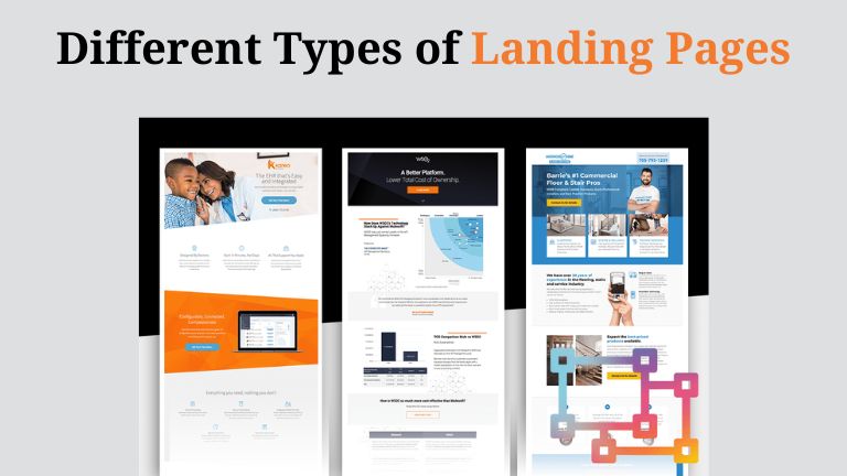
Marketers employ various landing pages to ensure their marketing campaigns succeed. Whether it’s for lead generation, webinar sign-ups, or other objectives, specific landing pages cater to all forms of advertising. Each type of landing page offers distinct benefits based on its primary call to action (CTA).
Landing pages play a crucial role in any digital marketing strategy. They compel visitors to take actions like making a purchase or completing a form. When executed effectively, a landing page can generate new leads or, even better, conversions.
However, selecting the appropriate landing page for your campaign can be daunting. This article will introduce you to the 14 most essential types of landing pages and explain how and when to use them.
What Are Landing Pages?
Landing pages are designed to boost the conversion rates of your marketing efforts, reducing the cost of acquiring a lead or sale.
A landing page is a standalone web page created specifically for a digital marketing or advertising campaign. It’s where a visitor “lands” after clicking on a link from an email, Google ad, Facebook ad, YouTube link, or another source.
Typically, landing pages focus on a single objective or call to action (CTA), unlike standard web pages that usually have multiple goals.
Marketers use diverse landing pages to craft effective advertisements. By aligning the page with the core message of your campaign, you can determine which type of landing page will be most effective. This alignment is possible only when you’re familiar with the various landing pages used in marketing.
Types of Landing Pages
- Splash Page
- Squeeze Page
- Lead Capture Page
- Video Landing Page Landing Page
- Click-Through Landing Page
- Long-form Sales Landing Page
- Unsubscribe Landing Page
- Paid Advertising Landing Page
- 404 Landing Page
- About Us Landing Page
- Get Started’ Landing Page
- Coming Soon’ Page
- Pricing Page
- Thank You Landing Page
- Squeeze Page
A squeeze page aims to collect the user’s email address. Once obtained, you can engage the lead with relevant content and additional offers.
Typically, a squeeze page involves gated content or a prompt to enter an email in exchange for a newsletter, ebook, whitepaper, or similar content offer.
Ensure your squeeze page is straightforward, with an enticing CTA to encourage users to share their email address. Also, make it easy for users to navigate back to the content that initially brought them to your site.
- Splash Page
A splash landing page doesn’t necessarily focus on lead capture. These pages often appear when someone clicks a social media or content link, redirecting them to an intermediary page before reaching their final destination.
This intermediary page, the splash page, might deliver an announcement like “New dates for our marketing conference are now available!” It could also request information such as language preference or age. Additionally, the splash page may display an ad, benefiting the publisher if the user interacts with it.
- Lead Capture Page
A lead capture page resembles a squeeze page but generally aims to gather more detailed information. Typical fields might include name, business name, email address, job title, and industry.
The specific data you request will depend on the objectives of the page and the goals of your sales and marketing teams, as well as the customer’s stage in the sales funnel. For a top-of-funnel lead capture page, avoid overly lengthy forms.
However, if a user has already shown significant interest in your product or service (e.g., by downloading multiple case studies), you can ask for more information to better qualify and direct them.
- Video Landing Page
A video landing page immediately pulls in viewers’ attention through its engaging video content. Oftentimes, the video lacks play/pause controls, compelling visitors to focus exclusively on the footage.
Using strategic techniques, you can display forms or buttons at various points, such as at 30%, 50%, and 90% of the video.
This type of page can highlight a product or service, explaining its features and benefits, or provide educational content like tutorials or how-to guides.
- Click-Through Landing Page
Every marketer understands the importance of providing value to customers before asking for a purchase. A click-through landing page accomplishes this by offering valuable information without immediately pushing a “Buy Now” button on potential buyers before they’re ready.
Typically, this type of landing page highlights the benefits and features of a product or service, and includes a call-to-action (CTA) button that invites customers to try a free trial. Once they click this button, they are directed to another landing page that details the pricing and requests payment information to start the trial.
By the time customers reach this payment page, they are already educated and motivated to proceed with the trial. Below, you’ll find examples of a click-through landing page followed by the corresponding payment landing page where customers commit to the free trial.
- Sales Landing Page
A sales landing page is crafted to convert website visitors into paying customers. These pages are most effective at the bottom of the sales funnel, targeting prospects in the final stages of their buyer’s journey.
Similar to direct mail sales letters, these pages are usually long and comprehensive.
Sales Page Structure
- Eye-Catching Headline with Big Idea + Strong CTA (above the fold)
- Explanation of How it Works + Illustrations
- Media Reviews
- “Us vs. Them” Comparison
- Comprehensive Benefits + Illustrations
- Customer Reviews
- “Unsubscribe” Landing Page
While you won’t build a campaign around your unsubscribe page, it’s still crucial not to overlook it. Ensure that unsubscribing is straightforward and offers users options to manage their preferences or adjust their email frequency. Consider incorporating links to other site sections, as seen in this example from Whole Foods.
Remember, just because users opt out of your emails doesn’t mean they won’t be interested in exploring your site further. Including a “second chance” button could encourage users to resubscribe if they reconsider.
- Paid Advertising Landing Page
To avoid wasting your budget, it’s crucial to direct customers who click on your paid ads to the correct landing page. Typically, the objective is to generate leads from these ads, rather than direct sales.
- 404 Landing Page
While 404 errors are never ideal, they can still be beneficial if designed thoughtfully. Use creativity and humor to soften the error message, and ensure you redirect visitors to your homepage or another neutral landing page.
You can even turn your 404 page into a lead generation tool. Take HubSpot’s 404 page as an example. It offers users three choices: visit the blog, learn more about the software, or sign up for a free demo.
- About Us Landing Page
Your “About Us” page doesn’t have to be a stopping point. Use it to generate leads as well. Consider Glossier as an example. Their “About Us” page not only details their history, vision, and mission but also guides readers on the next steps. The page ends with options to shop, follow, email, join the company, and an email subscription offer to capture emails.
- Get Started Landing Page
A “Get Started” page should feature your primary offer prominently. Look at Mailchimp’s example, which highlights the benefits of their tools for turning audience data into actionable insights. If users are interested, there’s a “Get Started” button readily available. For those needing more information, the page provides detailed features and benefits as they scroll.
- Coming Soon Page
If you’re about to launch a new product but aren’t ready to show everything, consider a “Coming Soon” page. Provide a teaser of your offer, include a launch date if available, and add a call-to-action asking for email addresses in exchange for a notification when your product or service launches.
- Pricing Page
When launching new pricing or product tiers, it’s wise to direct customers to your pricing landing page. This page needs to be one of the most optimized sections of your site. Take, for instance, Wistia’s pricing page, which effectively displays their three-tiered packages along with links for more details or to get started.
What stands out about their pricing page are two boxes placed between a list of features and a testimonial carousel. These boxes offer special callouts for users who might not fit neatly into one of the three standard pricing options.
For those who still don’t find what they need, scrolling to the bottom reveals a CTA that invites customers to “Choose your own adventure.”
- Thank You Page
Thank you pages are excellent for building rapport with new leads or subscribers. You can use these pages to convert Marketing Qualified Leads (MQLs) into Sales Qualified Leads (SQLs) by embedding an appointment calendar.
Another effective tactic is to outline the next steps for leads upon signing up, which helps with future pacing. Additionally, thank you pages can serve as platforms to showcase valuable resources or to embed a video expressing gratitude to new sign-ups.
How to Choose the Optimal Landing Page for Your Campaign
Now that you’ve familiarized yourself with common landing page types, it’s essential to decide: How do you select the perfect landing page for your upcoming campaign?
Start by considering the following questions:
- “What business objectives am I aiming to achieve with this landing page?”
- “How are my competitors meeting these objectives?”
- “What are my audience’s goals when they arrive on this page?”
- “What drove my audience to this page (i.e., what action or motivation led them here)?”
- “What is the desired action for my audience after they leave this page?”
Once your goals are clear, decide if a short-form or long-form landing page is most appropriate.
Short-form landing pages work best for squeeze landing pages, “Thank You” pages, and “Unsubscribe” pages. These pages generally involve a minor request or offer a small service to the visitor.
Long-form landing pages are ideal for sales pages, click-through pages, and pricing pages. When you require more from your customer, a long-form landing page is usually more effective.
To illustrate, consider a brand-awareness campaign for my new startup aimed at providing puppy snuggles to fatigued office workers (one can dream, right?). My business objectives for this campaign include capturing new leads (email addresses) and generating impressions.
Conclusion
Grasping the various types of landing pages equips marketers with the capability to align their strategies with specific objectives and target audiences. Whether the goal is to capture leads, boost sales, promote events, or elevate brand awareness, choosing the right type of landing page is essential for optimizing conversions and achieving marketing success.
By harnessing the advantages of each landing page type, marketers can craft compelling campaigns that engage visitors, provide value, and drive significant results.
Download our landing page checklist to enhance conversions and increase the number of leads generated from your landing page.
To further amplify your marketing strategies, explore my other blogs on “Why and When to Use Landing Pages” and “Essential Principles of Landing Page Design.”
Also Read About
