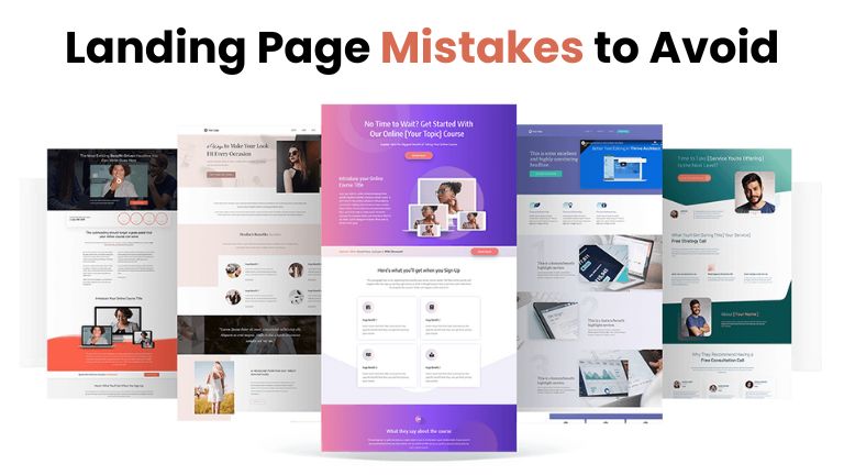
An effective landing page is vital to convert your visitors into quality leads and sales. But, as skilled a marketer you are, there can be some mistakes that serve well to slow down your landing page in its pursuit of glory. Optimize your landing page for success suggested reading: What are the most common mistakes of a good website?
- Thick Design
Mistake: Placing too many elements (images, text, and videos) on the landing page creates chaos for visitors.
Solution: Clean, simple design. Focus on one Call-to-action (CTA) and make crucial info readily available. Use whitespace appropriately to direct the focus of visitors on detail items.
- Weak Call-to-Action
Mistake: A weak call-to-action tells a website visitor that they should do something but fails to instruct them how.
Solution: Clear, strong CTA – no more hiding that call to action; make it easy for people who are already ready! The wording you choose should inspire them to act right now or in the next series of steps, e.g., Download Now, Sign Up Today, Get Your Free Trial, etc…
- Slow Loading Speed
Mistake: One layout mistake has slowed down load times which can make visitors frustrated and give bounce rate.
Solution: Compress images, collaborate only with reliable hosting services, and minimize using heavy scripts on your landing page. For one, you may use the likes of Google PageSpeed Insights to analyze for places wherever enhancements can be made.
- Mobile Optimization
Mistake: Poor user experience occurs when potential customers are sent a landing page that is non-optimized for mobile.
Solution: Make your landing page responsive and seamlessly adapt to all types of devices, especially smartphones/tablets. Test your page on different devices.
- Slow Loading Speed
Mistake: Headlines that do not entice visitors in stand no chance.
Solution: Develop an attractive headline that communicates exactly what your lead bribe is. Use vibrant words as they are direct and instantly eye-catching – the headline of a blog should not only tantalize but describe what its page is about.
- Too Much Text
Mistake: overloading the landing page with text can discourage users from reading through all of it.
Solution: Keep the text short and direct. Bullet pointing, subheaders, and shorter paragraphs will aid in creating easy-to-scan content. Focus on the top benefits and stay clear of unnecessary jargon.
- Ignoring Visitor Pain Points
Mistake: If you don’t address the specific needs and pain points of your audience, it’s likely going to mean poor engagement — as well as lower conversions.
Solution: Know who your target audience is, and use that knowledge to solve their problems with a unique selling proposition. Speak their language and explain to them in clear terms how your offer can address what they are facing.
- Cheap Visuals
Mistake: Another reason some business owners had site visitors who declined the free offer is because they use poor low-grade images that do not match the message or brand.
Solution: Use some good, sensible and relevant pictures and videos that support your message. Make sure images are high-quality and serve to improve the overall aesthetic of the landing page.
- Too Little Social Proof
Mistake: If you do not add social evidence (like testimonials, reviews or case studies) visitors are very unlikely to trust your provide.
Solution: Use social proof elements such as testimonials, star ratings and case studies to establish trust and credibility. Call out kudos and data that proves your product or service is being well-received.
- Ignoring Analytics and Testing
Mistake: Failing to track results and optimize based on data can cause you to miss opportunities rather insensitively.
Solution: Monitor your landing page performance with analytics tools. Monitor important metrics like your conversion rate, bounce rate, and time on page. Use A/B testing to test different attributes against one another and, depending on what the results are, continue to optimize in favor of better performance.
Conclusion
By avoiding these common landing page mistakes, you will make your call to action MUCH more compelling and effective. You can make a landing page that will bring both, prospectively you should provide impeccable design and clear CTAs to enhance its capability wait hall has then now for turning visitors into consumers. Make sure you are continuously testing and optimizing the page to maintain its effectiveness correlated with your audience.
